In modern discussions of aesthetics, it's common to hear phrases like “beauty is in the eye of the beholder” or “it’s just a matter of opinion.” While aesthetic taste varies, not all beauty is purely subjective. Certain forms and proportions have remained universally appealing throughout history, drawing the eye and evoking a sense of harmony, even if we don't consciously recognize the underlying patterns.
Most people can sense when one design is superior to another but may struggle to articulate why. Classically trained architects and designers, however, studied proportion and visual harmony to create designs that are both timeless and pleasing. The foundational rules of design and proportion were established by the Greeks and Romans and later reaffirmed during the Renaissance. These early architects looked to nature and the human form for inspiration, discovering an ideal mathematical relationship known as the Golden Ratio. This ratio, roughly 3:5, manifests most clearly in the golden rectangle—a proportion considered inherently pleasing to the human eye.
The Human Scale in Classical Design
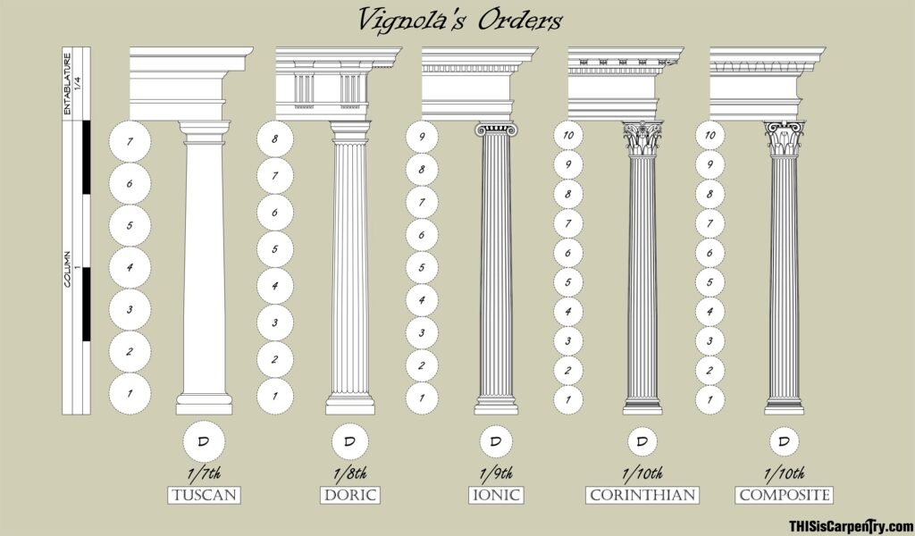
The human body serves as an extraordinary study in proportion, and the Greeks and Romans incorporated these principles into their architectural systems. The five classical orders—Tuscan, Doric, Ionic, Corinthian, and Composite—are all based on human scale, particularly in the height-to-width ratio of columns.
The Tuscan and Doric orders, with a 1:7 ratio, are associated with masculinity due to their sturdy, robust proportions.
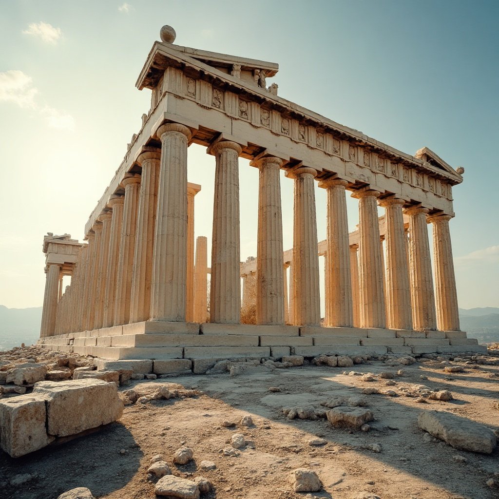
Example of Tuscan Proportions is the Temple of Jupiter Optimus Maximus
The Ionic and Corinthian orders, with more slender 1:8 and 1:9 ratios, respectively, reflect feminine elegance and grace.
One of the most iconic examples of Doric architecture is the Parthenon, built in the 5th century BCE to honor the Greek goddess Athena. This peripteral Doric temple features exterior columns measuring 6.2 feet in diameter and 34.1 feet in height, all adhering to strict proportional rules.
The Roman engineer Vitruvius, author of De Architectura—the only surviving architectural treatise from antiquity—discussed how different classical orders embodied distinct personalities. This adherence to human-scale proportion is one reason classical architecture remains so inviting. When we find a room particularly pleasing without knowing why, it's often because it follows these classical principles, creating a subconscious sense of balance and comfort.
The Decline of Harmony in Modern Architecture
As preservation architect and author Jonathan Hale observed in The Old Way of Seeing:
There was a time when one could walk down any street and be surrounded by harmonious buildings. Such a street wasn’t perfect, but it was alive. The old buildings smiled, while our new buildings are faceless. The old buildings sang, while the buildings of our age have no music in them.
The designers of the past succeeded easily where most today fail because they saw something different when they looked at a building. They saw a pattern in light and shade. When they let pattern guide them, they opened their ability to make forms of rich complexity. The forms they made began to dance.
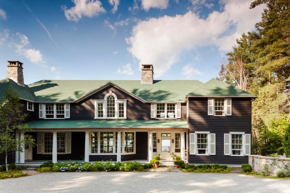
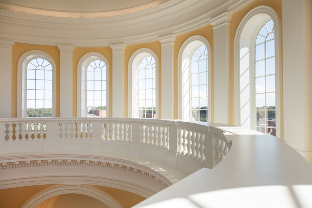
A great building can elicit the same emotional response as a breathtaking natural landscape. We expect this from grand architecture, but even an ordinary streetscape—when designed with these principles—can create a sense of belonging and visual harmony.
The Importance of Proportion in Window Design
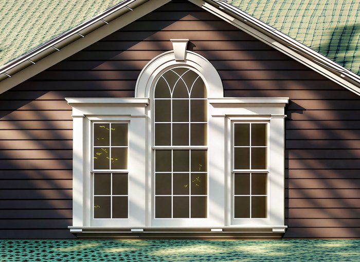
One of the most glaring examples of modern disregard for design principles is the treatment of windows. Many contemporary designs fail to respect classical proportions, resulting in visually unbalanced facades. Understanding the components of a well-designed window can help train the eye to recognize—and avoid—bad design.
What is wrong with this image? The Header is much too large for the window and the window doesn't have casing around it, the proportions are all off and don't create harmony in the design.
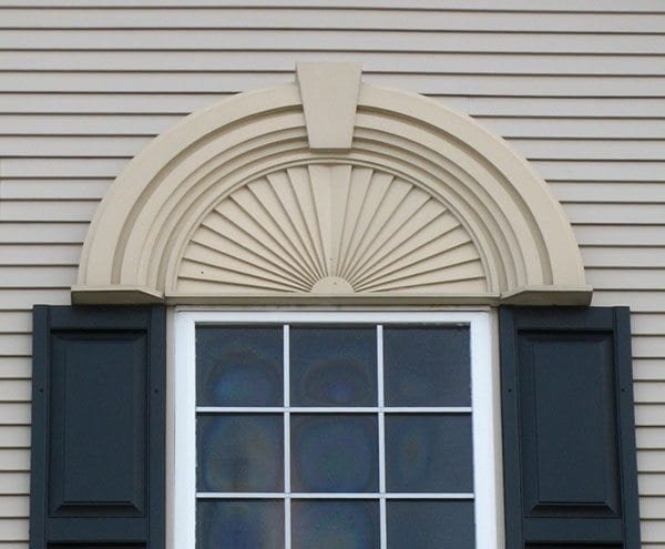
Window Header
The window header (head casing) is the horizontal board at the top of the window frame. Key design rules include:
The header should extend no more than 1 inch beyond each side of the jamb casings.
The header should be taller than the side casings to give the appearance of supporting the structure above. A good rule of thumb is that the header height should be at least 1/6 of the window opening (measured from inside edge to edge).
Well-proportioned header, casing and window sill. Notice how the shadows create pleasing depth
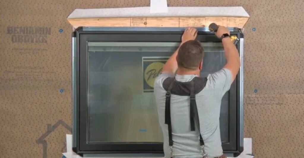
Drip Cap
Positioned directly above the window header, the drip cap serves two purposes:
Functionality – It diverts rainwater away from the window, preventing water damage.
Aesthetic Separation – It acts as a subtle architectural punctuation mark, creating a visual break from the siding.
A drip cap must always include proper flashing to ensure water is directed away from the structure. While traditional double-hung sash windows feature integrated wooden drip caps, modern vinyl windows typically use aluminum alternatives.
This shift is one reason replacing historic windows with modern counterparts can disrupt architectural harmony. Traditional windows were designed with proportional integrity, while many modern designs disregard these principles, resulting in a jarring visual imbalance.
The Flat Modern Windows
One reason why modern windows sit flush or almost flush with the facade of a house is the new way in which most modern windows are installed. Many of them come with what is referred to as a nailing fin. Which as you guessed it just a flange that is nailed into the surrounding framing. This makes window installation much easier and a less labor-intensive task. However, what is lost is all the beautiful shadow lines and depth of the old windows.
Modern windows often are secured with a nailer along the nail finHistoric reproduction of a double-hung sash window.
A "Proud Window" is a term used to describe a particular type of window design that stands out—though not for the right reasons. There’s no official industry term for it, and if you mention it to a window salesperson, you’re unlikely to get a clear answer. Through my own experiences researching and “fake” shopping, I’ve yet to hear a solid explanation from any professional.
The term "proud" refers to how the window sash sits on the exterior wall—it protrudes rather than being recessed within the window casing. Essentially, a Proud Window appears as a single, picture-framed unit, lacking both a header and a sill. Unlike traditional windows where the sash is set back about three inches within the casing, the Proud Window’s sash is flush with—or even extends beyond—the siding of the house.
Visually, it resembles a toy window from a child’s building set, as if it were simply snapped onto the house from the outside. This design results in a flat, uninspired appearance, completely devoid of the depth and shadow lines that give traditional architecture its timeless character.
Notice the simulated divided light, the muntins are just glued onto the inside of the window.
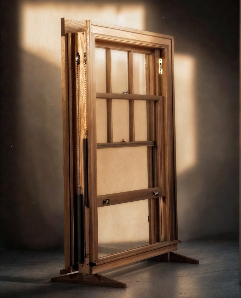
Old Windows: Layers
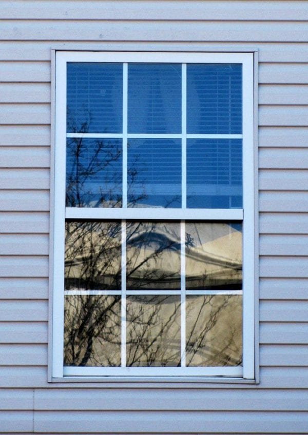
What creates the shadow lines on historic double-hung sash windows is the way that they are constructed. This is both an aesthetic as well as a practicality.
On a Historic window, there are two layers before you get to the first sash, which is the casing then the blind stop. The upper sash is closest to the outside. In between the upper sash and the lower sash is the parting bead. This is a piece of wood that is generally just held in with a few finish nails and separates the lower and the upper sash channels.
Layer of a historic double-hung sash window
If you factor in the shadow line from the muntins and window frame you already have 3 layers of depth on a historic window. Compare that to a modern window where the muntins are glued on the inside and you don't even have a single layer of depth and shadow line which is why the look of modern vinyl windows on an old house that still has original windows is so jarring.
Conclusion
Understanding and applying classical design principles—especially in proportion and scale—ensures that architecture remains timeless and inviting. Whether designing entire buildings or individual elements like windows, respecting these fundamental rules fosters beauty, harmony, and a sense of place that transcends fleeting trends.